Dual Invest
Overview
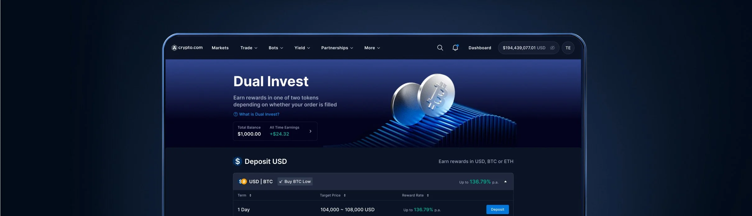
Launch a new product that allows users to earn yield while buying low or selling high. The design focused on simplifying complex logic with clear outcomes, reward previews, and intuitive inputs, making the experience accessible to all trader levels.
Role
Collaborated with another designer to design and align the end-to-end Dual Invest flow across both web and app. Focused on creating a unified experience that simplifies complex financial logic while adapting effectively to different screen sizes and user behaviors.
Duration
2 months
Skills
Research, Strategy, Wireframe, User Testing, UI Design
Problem
Structured financial products often feel intimidating due to unclear reward logic, complex terminology, and a lack of transparency around risks and conversion outcomes, leading to hesitation and low user adoption.
Key Insights from User Research
“Conversion logic” and “APR” can be confusing without real examples
Users wanted to “try it small first” and see results before committing more
Users didn’t understand what token they'd get back

Design Strategy & Principles
Reduce jargon, create a conversational experience
Guide, don’t overwhelm
Progressive disclosure: show just enough detail at each step
Visualize the outcome
Make "you’ll get X or Y" clearly visible and interactive
De-risk the experience
A key shift in the flow is changing the selection process from choosing which asset to buy or sell, to simply choosing the asset to deposit and earn rewards. This reframing simplifies decision-making and aligns better with how users think about their available balance.
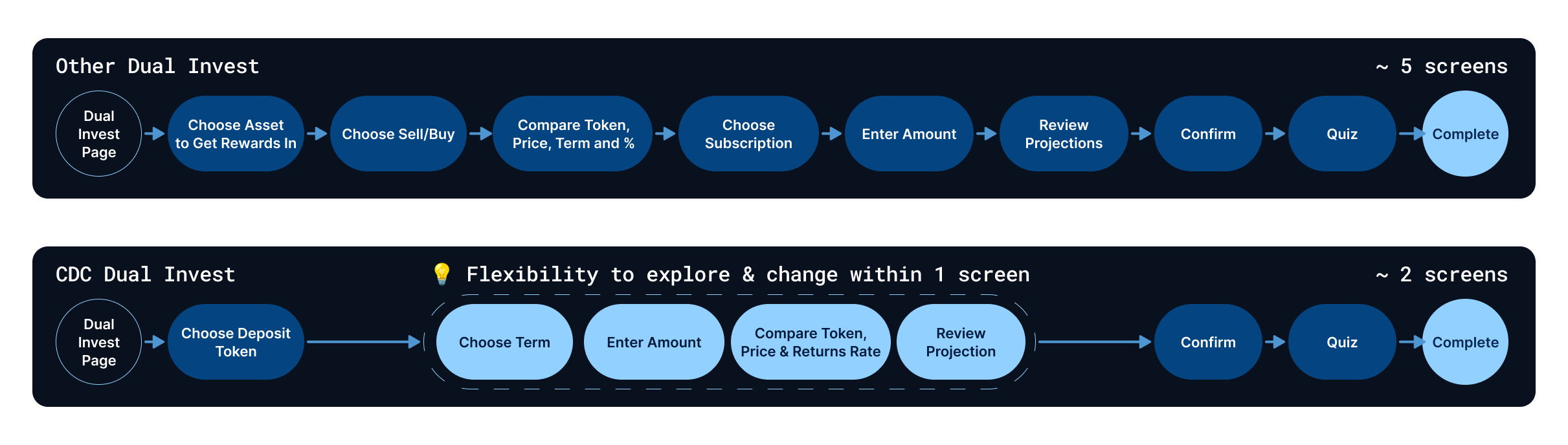
A New Flow

Explore
Enabled users to select from assets they already own, helping them decide which token to invest and which one they prefer to earn in. This clarified the starting point and payout currency, making the reward path feel more personal, intentional, and easy to understand.

Review Terms
Designed a streamlined, conversational experience that guides users through Dual Invest options with clarity. By allowing users to slide directly on the reward graph, they can explore the relationship between strike price and potential returns in real time — making it easy to find the setup that fits their goals and risk tolerance.

Designed with a toggle that lets users switch between a full outcome preview and a simplified view showing only essential information. This gives users control over how much detail they want to see, especially useful for mobile where space is limited.
Deposit
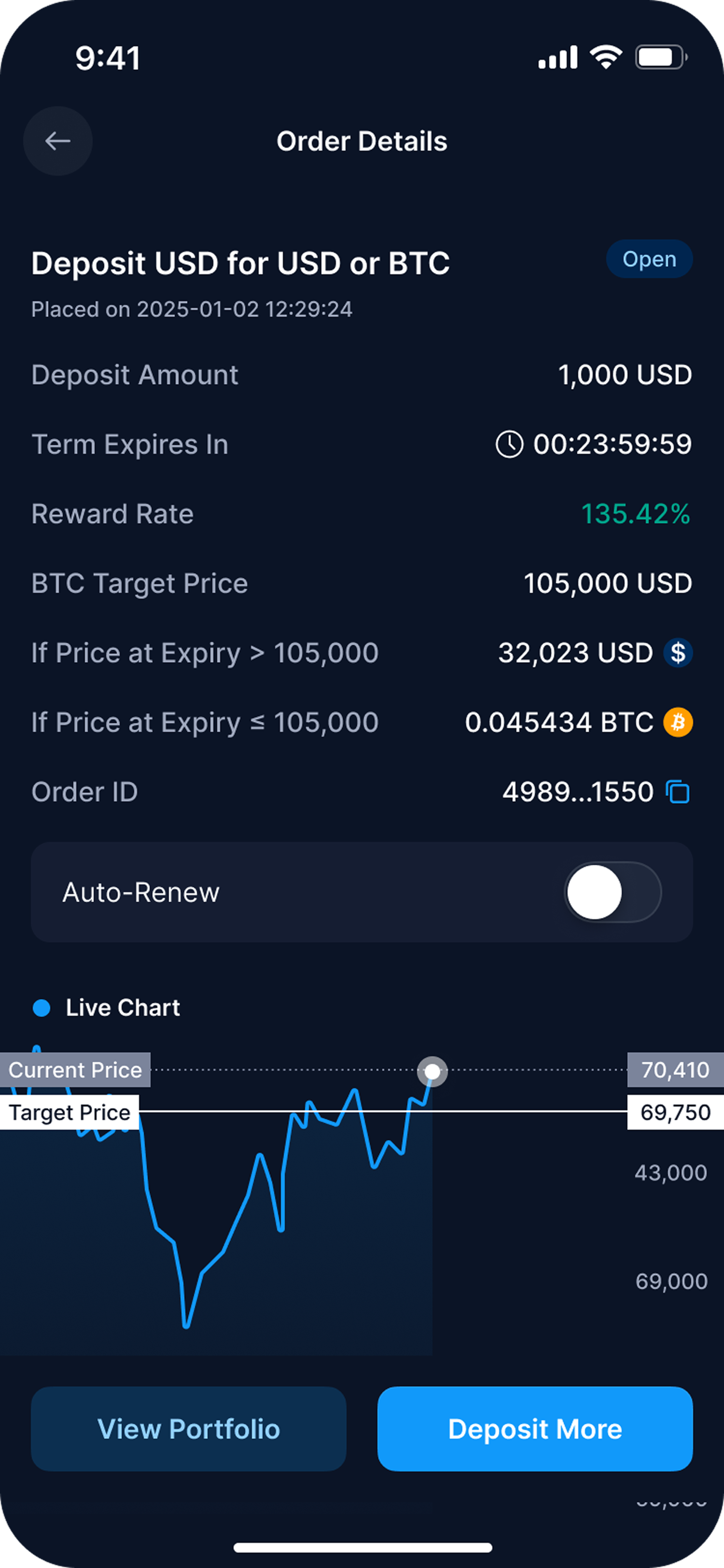
Order Details
Order details that clearly communicates the two possible outcomes based on expiry price, supported by real-time chart context. Key details like reward rate, time remaining, and asset breakdown are prioritized for clarity. An Auto-Renew toggle and action buttons streamline post-deposit actions, while the chart enhances users’ understanding of market movement toward their target.
Impact
Increased user confidence by clearly showing both potential outcomes and payout currencies
Improved retention through real-time chart context and clear next-step actions
Higher engagement from the ability to deposit again or manage Auto-Renew directly after reviewing order details